Friday, February 24, 2017

Choosing a Format: Landscape, Portrait or Square?

We’re going to start a series of posts I’m informally calling 
Which Portfolio Presentation is Right for Me? 
Where we’ll cover everything from the basics: Style, size and color, and structure to the tiny details that can set you apart- embossing, color blocks, insets, screen printing.

Let’s start with maybe the most basic decision, but an important one nonetheless. Landscape or portrait? Which one is the best to showcase you and what you do?
We find that the same sorts of people working in similar media and fields tend to gravitate towards similar styles of portfolio, and with good reason.

Landscape or Horizontal Orientation:

Architects, Photographers, Industrial & Lifestyle Designers.

Many of our landscape portfolios, especially those that lay flat, are perfect for two page spreads for panoramics and- even for those who may work a lot in more vertical, portrait oriented work- fantastic for showcasing dyptics and triptics or photos alongside text.

Album for my own Wedding- Photos by Lisa Callamaro

Rodney Richards sleek photography Portfolio. His logo and his work are stunning.

Overall, the 11 x 14 landscape hidden screwpost portfolio is our most in-demand style for visual artists.
Some prefer our 11 x 17 inch landscape portfolios for extra horizontal space.

Portrait or Vertical Orientation:

Portrait Artists and photographers, business manuals, playwrights, restauranteurs (the 11 x 8.5 inch format makes a gorgeous menu)
Handsome Portrait format Hidden Screwpost Menus for Miro Whiskey Room*     
Sharp Portrait Format Photos in the Portrait Format Portfolio of David Lopez *
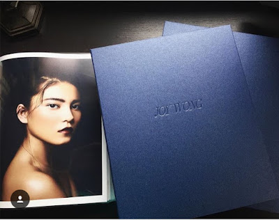
Portrait Format Portfolio Showcasing the Gorgeous Photographic Portraits by Joy Wong*

And, lest we forget, the Square Format!

This is both a sleek and versatile option. Adored by analogue photographers and those who love the symmetry and timelessness of square format. The 12 x 12 inch Coffee Table Style Portfolio is also a favorite for those wanting a custom book to hold those precious family memories: for everything from baby books to Wedding albums!

Coffee Table Square format baby book for a bookbinder's daughter

Be Unique and Unexpected!

Know your style and trust your gut- no one knows your branding more than you. Just because you paint or design or shoot primarily in the vertical does not mean you necessarily need to use a portrait style portfolio or vice versa. 

Beautiful Landscape format Photos by David Lopez displayed in his Portrait format portfolio

Mixing it up! David Lopez keeps it interesting with mixed format photographs in his portrait style portfolio

The above from David Lopez's Portfolio show a prime example of how gorgeous and unexpected playing with the negative space of your page can be in highlighting your work.

We know how difficult it can be selecting a portfolio style can be. While there are many options to choose from it doesn't have to be a paralyzing decision. Remember that each format has it's benefits and hopefully the examples we've shared with you today give you some ideas.

It may also help to make a few mockups of your layout either InDesign or IRL- wherever you do your best work! 


Tuesday, February 14, 2017

Bookbinding and the Unexpected Everyday Object

Custom bookbinding is an old tradition and pretty niche industry. Whether a binder makes handsewn embossed leather tomes or sleek modern structures like our screwpost portfolios, albums and portfolio boxes, most of us in this industry got into our profession, at least in part, because of our love of books: their form, their varied structures and their roles in our everyday lives: as beautiful and protective capsules for important text, images and information.

But every so often a job calls for us to reframe our roles as bookmakers to create something a little more unorthodox.

We enjoyed our recent collaboration with Garnica Interiors to create these beautiful and hardy boxes as a smart clutter solution for a client’s laundry room. The larger of the boxes features a magnetic front for easy access as it will sit high on a shelf, and the custom turquoise color ordered specifically for these boxes matches the tile in the room. We hope for photos and can’t wait to see how they are incorporated in the space.


This recent job also brings to mind the deceptively simple flax linen storage boxes we made for another of Garnica’s clients a while back, among other home furnishing orders. These sleek, utilitarian containers are all function without sacrificing form, with the quiet power to transform a domestic or working space into a more serene, productive space.


Days like these have us thinking it might be time to really step up our own laundry room game! Why not update the old Ikea Kallax with something a little more chic and coordinated to the room’s color scheme? Why suffer flimsy corrugated file boxes or that weird junk shelf under the entryway table when you have hearty bookboard and a variety of bookcloth colors to choose from?

Friday, October 23, 2015

Spine Covers to Enhance and Protect Portfolios

Spine covers provide the look of a hardbound, fully cased in coffee table style book, but provide the flexibility for adding and subtracting pages from your portfolio as need be. The spine cover is a "U" shaped channel that hides the spine edge of your portfolio pages and is sandwiched between the front and back covers.

Why choose a hidden screw post portfolio with a spine cover over a coffee table style portfolio?
If you decide to increase or decrease the number of pages inside your portfolio you will be able to simply purchase a new spine cover and screw post set to fit these pages rather than order an entirely new coffee table style portfolio.

Spine covers are most frequently paired with hidden screwpost portfolios, but can also be paired with exposed screwpost books, and made to match or complement the front and back cover, logo color, slipcase, clamshell, inner liners, pockets, etc.  They can also be screen printed or foil stamped with your logo or title of your portfolio, especially handy when your portfolio is encased in a slipcase.

Spine covers not only act as an additional design element to provide a sleek, finished look to your portfolio, they also protect your portfolio's spine and pages from dust and wear.  There is no portfolio more polished and protected than a book paired with a striking spine cover and encased in a matching slipcase or clamshell box.

The below gallery features just a few of our favorite projects that include spine covers.

Click here to see spine covers on our website.


Tuesday, October 13, 2015

Custom Inlays for a Unique Edge

Inlays are a great way to add a splash of color or add some interest to the composition of your portfolio or box cover. They are particularly effective when used in conjunction with foil stamping and embossing.

Inlays can be made using any of the book cloths, can be any size and placed anywhere on the cover, along the top, bottom or foredge of the portfolio or box cover. They can also be placed along the spine edge of exposed or hidden screw post portfolios, on the spine or wrapping around the spine of a coffee table style book. 

Inlays can also be long and skinny, tall and wide, rounded, squared or oblique. You may also choose to have multiple inlays on your book. Our clients often choose inlays that contrast or complement the cover color and/or match the inner liners and pockets.

If you have a question about adding an inlay to your portfolio please call or email kristin@kdbooks.com

2 Rounded Pink Inlays with White Foil Stamping on photographer's portfolio

Hidden Screwpost Portfolio with Spine-edge Inlay
Oblique Orange Inlay to match slipcase
Sharp white foil stamped logo on slate inlay to complement a Metallic cover

Top aligned Bright Yellow inlay to match inner liners

Contrasting Inlay with Foil Stamping to Match the Cover Color on Landscape Architect's Portfolio

This Red Inlay with a Bold Metallic Font really pops against the Black Cover on Photographer's Portfolio 
Bright Blue Inlay adds a Splash of Color to a Neutral Cover

An Unexpected Flash of Ochre on a Set of Illustration Portfolios


Friday, September 25, 2015

Introducing Flap Book Portfolios

Over the years, we've done a number of interesting and functional custom portfolios and boxes with flap closures.

Flap closures are great as both a design element and for practical purposes. Not only do they add to the presentation of opening your portfolio book or box, they add structural protection for your portfolio's contents, as well as help to hold your portfolio closed, whether with hidden magnets or with ribbon ties.

We enjoy the added quality and functionality of our custom flap projects, we decided to add the Flap Book Portfolio as a new portfolio option available for order directly on our website:


The flap closure of our flap portfolio is a variation on our coffee table style portfolio and features a support that keeps the portfolio flat no matter how few pages you've put into it. A great option for in progress portfolios!
This particular book has flap to match the inner liners and contrast the light brown covers. The linen book cloth is folded at the seam on the back cover to prevent fraying, to complete the clean look.


For inspiration for the design of the new flap portfolio,  we've been looking through the archives of our flap projects. Here are a few of our old boxes, books and folders all featuring different variations of the flap:


Tuesday, September 15, 2015

Invitation Presentation Binders

While we offer a wide variety of handmade portfolio and box structures, we find the most popular format chosen by stationers, calligraphers and invitation designers is the custom three ring binder.

With a three ring binder pages are easy to change out, and allow plenty of room for envelope flaps, layers of paper swatches, heavier paper or varied thicknesses of pages, as well as other accoutrements.

As with all of our custom portfolios, the ways in which our binders can be customized are virtually limitless. Some of these examples from past clients show the unique ways they've chosen to show off their brands, using a combination of our customizations.

Inkjet Printed Bookcloth Cover with Contrasting Liners:


Screenprinted Logos on Spine and Front Cover with Contrasting Liners:


Foil Stamped Covers and Spines with Custom Specialty Paper covered Liners:


Screenprinted Logo on Front Cover and Spine Combined with Custom Insets:


In addition to having a stunning cover design, you can add further wow-factor and functionality by adding contrasting liner colors.  Pockets can also be added to the front or back liners for the storage and display of Invitation folders, handouts, takeaways or business cards!

The National Stationery Show in NYC, and many other stationery trade shows are in late spring, but it's never to early to start thinking about how you'd like to customize a binder to best suit your unique brand.

In addition to being a popular item with stationers and invitation designers, binders make beautiful keepsake photo albums and a unique and modern take on guest books!

Monday, February 9, 2015

Swatch Books and All New 10% Student Discount Available

As former art students ourselves, we're no strangers to how expensive art school can be. In addition to the standard tuition, books, housing and other fees all students pay, we also have the additional cost of those expensive art materials!

All that being said, you don't want to skimp on an eye-catching portfolio, when you've already made an investment in your arts education. We want to help you create a beautiful and memorable portfolio  that will stand out in a sea of portfolios and economy presentation books without cutting into your ramen and Red Bull budget. (Yeah, we remember that part too.) 

Because we know every little bit helps, we are now offering a 10% Student Discount.  This offer is good on all portfolio styles on our website, or custom made portfolios by contacting kristin@kdbooks.com directly. 

To get the discount please ask your professor to send a list of student names to kristin@kdbooks.com and we will send a special coupon code for your class to use. Additionally, we will send a 4 x 4 inch swatch book for the class to share. It will be easier and faster for your students than waiting to receive individual swatches!


This offer is perfect for students of Photography, Illustration, Graphic Design, Architecture, Fashion Design, Interior Design and so much more.